The time it takes to change the time
You might remember from last year my map showing the difference between solar time and standard time; you might because it was by far the most shared content I created, and somebody even uploaded it to Wikipedia for the time zone article. But with great power comes great responsibility (…); in this case it means keeping the map up to date as the whims of the time regulators change. You would think this is a rare event, but when you consider the 200 or so sovereign states in the world, and the quadratic number of possible conflicts between them, it becomes a frequent event.
Indeed, the triggering event that prompted me to draw a new version wasn’t the bad color choice of the first attempt (for many people, green and red do not play well together), neither the small mistakes in the zone divisions, and not even some political faux pas (not marking Taiwan in the same way as most other sovereign states). After all, the map was drawn on top of an existing one found on Wikipedia, with just minor modifications apart from the gradients.
The real reason is that just a few months after releasing my map, Russia decided to change the time in most of the country. Since Russia extends to about 3.5% of the world’s area and 11.5% of the emerged lands area, the issue was too obvious to ignore.
Apart from this big change, the new map reflects that some territories in Ukraine and Georgia follow Moscow time instead of their countries’ timezone, and the introduction of the “Southeast” timezone (permanent UTC-05:00) in Quintana Roo, Mexico. Continental Mexico is about 30 degrees of longitude wide, from Tijuana to Cancun, so two timezones would make sense, instead it has four!
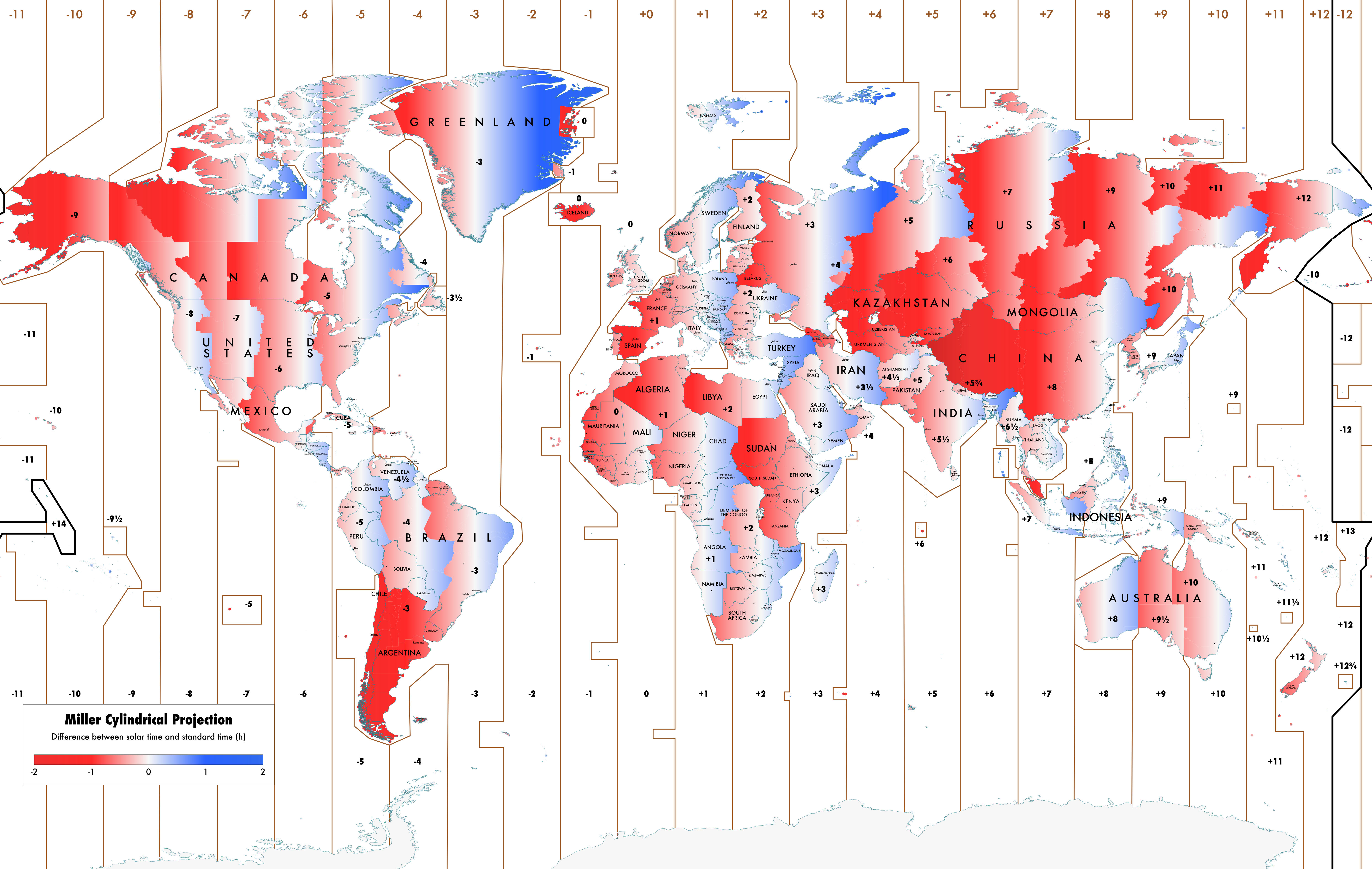
Overall, the map is still skewed towards the red (which means that the solar noon is later in the day), and most of what could be observed from the first version is still valid. In particular, for the joy of reddit commentators, China is still very red.
Sadly, one change did not happen: Australia still refuses to make Central Western Time, aka the awesome UTC+08:45 timezone, official. You see how the difference between Western and Central Australia is a whole hour and a half? This is not a big problem because no people live on the transition zone, apart from a very narrow strip of 350km along the southern coast, on the road between Perth and Adelaide, where about 200 proud people live on their own time.
If made official, it would be the timezone with the fewer residents (followed by UTC+10:30, Lord Howe Island, with about 360, and UTC+12:45, Chatham Islands, with about 600), apart from the ephemeral UTC-12:00 timezone: only a few birds inhabit the two US islands of Howland and Baker, that are the only emerged lands in it, with their whopping 4 squared kilometers. But, since they are uninhabited, nobody ever said what time they should follow, and they are unofficially UTC-12:00 just because they happen to be at the correct longitude..
I mentioned that 90 minutes is an unusual large difference between neighboring timezones, since of course the usual is one hour. But there are many places with much larger differences: these always involve China, thanks to its single, big, timezone. The worst offender here is the 90 kilometers border between Afghanistan (UTC+04:30) and China (UTC+08:00): a difference of three hours and a half!
How to draw a map
Drawing the first version of this map was a very long process done more or less by hand, modifying the source of an existing SVG file, and I definitely did not want to go over the same process again (and again when something else changes). So I blatantly ignored xkcd and proceeded to Create the Tool that would Create the Map for me. The real value of the tool for the future depends on the availability of up to date data, still I can trick myself into thinking I saved time.
All the tools I will mention in the following can be found in the solar time vs standard time repository.
Looking at a map, people often do not realize how many ingredients combine to create it; we take a lot of things for granted. This map has probably a sub-average number of ingredients, though we can see:
- timezone boundaries over the sea (approximate, as the territorial water boundaries are too intricate to draw);
- land/water and country boundaries;
- timezone territories (which are a different hierarchy than countries: a country might have more than one timezone, and a timezone might encompass more countries);
- cities coordinates;
- labels of:
- countries;
- cities;
- timezones.
Luckily, there are datasets available for most of these; some with a unique source, maybe slightly out of date, some with more sources. It turns out that choosing the best in terms of accuracy and license is an important step when creating a map programmatically. In our case, timezones come from Eric Muller’s website, and the same for country boundaries (these in turns come from the FIPS dataset). Homogeneity is an important quality, and since timezone boundaries is a very rare dataset, it made sense to take the country boundaries from Eric as well. Coordinates of major cities (with other info useful to select whose to show) instead came from the ESRI datasets.
But getting the data is just the first step. The second is not very hard: draw the SVG with the boundaries. This involves some templating to create the file and most importantly translating latitude and longitude into pixel coordinates (that is, the choice of a projection). Again, I was constrained to a rectilinear projection because drawing the gradients was much simpler, so I sticked with the Miller.
Third step, writing the labels. Here there is an important choice: is it faster to design an algorithm that tries to place the labels automatically, or to place them semi-manually? The first option is not that easy: I would frame it as an optimization problem, where the function to optimize depends on the distance between the labels and what they refer to, on their size, and on how much they overlap, but I admit I did not try this. Instead, the semi-manual approach consists in placing the labels in a reasonable position (at the centroid of the country, and anchored to the coordinates of the city), and then to tweak the labels that need tweaking.
Fourth step is drawing the labels and lines of the timezones. For the labels, I just wrote a list of positions I wanted, so again very manual. For the lines, in theory a good approximation could be just drawing 24 equispaced meridians, but the map becomes very hard to read. To make easier the job of drawing a lot of polylines on a map, I wrote a very simple helper tool based on Maps API, that allows to draw directly on the map and retrieve the coordinates of the vertices in a JSON format.
Finally, the last step: data correction! Eric Muller’s data sadly is not completely up to date. Some fixes are easy (just changing the offset of a few timezones), others are not so simple, and I eventually decided to just use GIMP to draw over the final image generated by the program (which explains the GIMP file in the repository). Shifting the center of the map so that the cut point is not over Siberia was also done in postprocessing; in theory it should be easy to do at the projection stage, but the source datasets already split all lands on the 180 meridian, which made more convenient to use the same cut point in the projection.