Some photos and statistics
I recently posted 120 of what I considered the best photos I took on Facebook. Here’s some stats about how much my friends liked them.
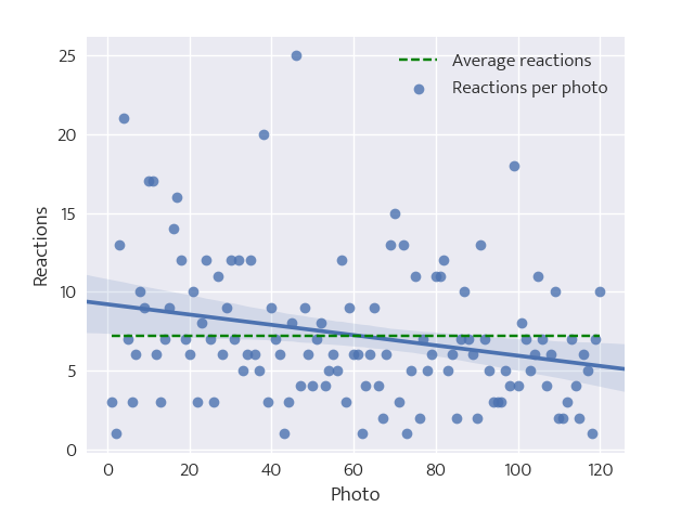
Ideally I posted one photo per day, named from 1 to 120; but life happened and I had a hiatus of a few weeks. Regardless, let’s assume that each day there was a photo, so the index is also a time quantity.
We can start with some high level stats: there were 867 reactions, that is a little bit more than 7 per photo. While posting, I got the impression the novelty wore off after a while, and friends started to get tired. Indeed, a simple linear regression shows a negative coefficient.
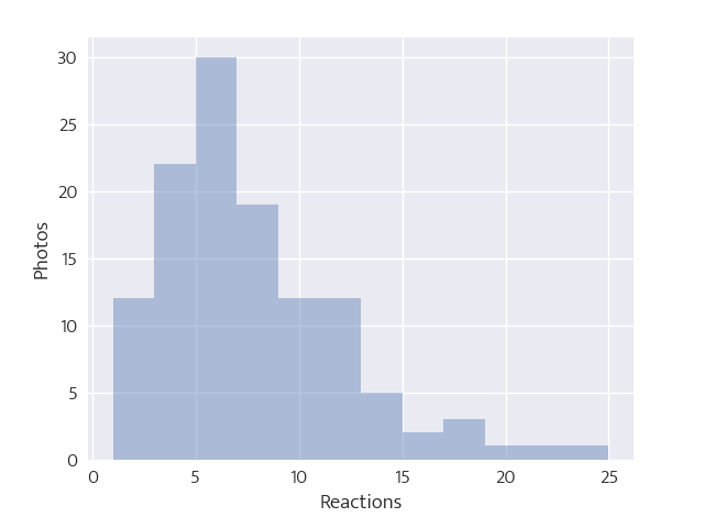
If we group by number of reactions, we the histogram on the right.
It looks like a decent Poisson distribution. Indeed, we can assume reactions happen only on the day each photo was posted, and so the number of reactions per day should indeed be a Poisson. Of course, this also assumes reactions are independent on the quality of the photo… maybe that’s a good assumption.
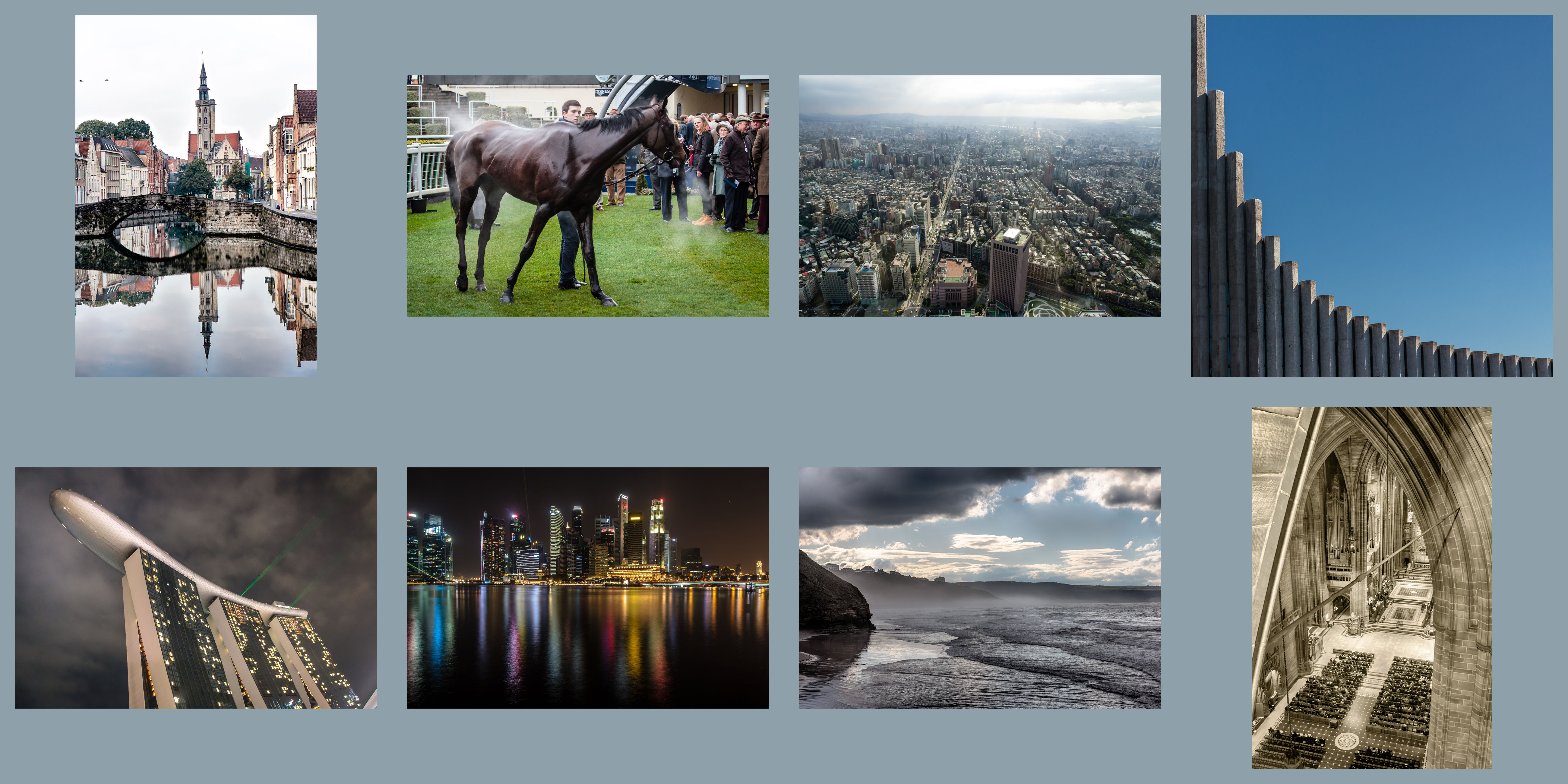
The top photo has 25 reactions, and other 7 have 15 or more reactions. Here they are, in order (left to right, top to bottom):
Speaking of low-lights instead, here are the 5 photos with only one reactions (we will soon talk about that):

Overall, I think it’s fair judgement. There are some weirdness: the top right best photo (Hallgrimskirkja, in Reykjavik) has probably many laughing reactions due to the witty pun I added as comment, rather than due to the photo itself. On the other hand, I would have expected the first worst photo to be appreciated more.
So, why no photo has no reactions? Well, let’s see a histogram of how many people liked a certain number of photos:
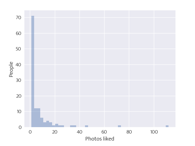
You can recognize a pretty good power law (alpha = 1.8), but also some outlier; the person that liked 112 photos (93%) as you can imagine, is my mum. The most likely explanation for the remaining 8 is some bug in Facebook’s news feed.
The reason for this silly post was just to try out seaborn, a plotting library for Python on top of matplotlib. It makes easy to plot a limited set of graph types, and in addition has a decent preset style: that is to say, exactly the opposite of matplotlib. So I couldn’t really finish without using the coolest graph type it allows: violin plots.
I split the 120 photos in 9 categories, here listed from the most frequent to the least: architecture, cityscapes, landmarks, landscapes, people, close-ups, animals, nature, and textures (landscapes and nature are similar, but the former has some human-sourced component). And here’s the reactions in this sets behaved:
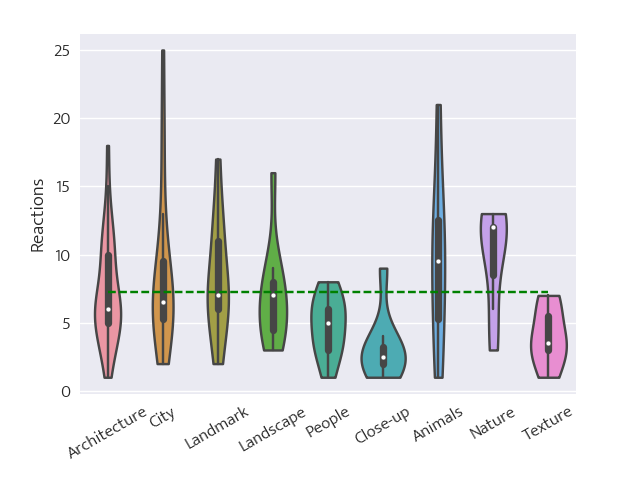
Beautiful. Animals and nature are the overall favourites, which again shows: the Internet loves its kittens.